My 2024 Portfolio
This is all of the work I’ve produced in college
from 2021 until Spring of 2024.
My first and only dive into the world of graphic design was this rather rough looking man with the accompanying gothic text that reads, “STILL ILL AND RATHER GAUNT”, which is also what I refer to the piece as now. The original design was done on paper with a felt-tip pen. I then took a picture of it, brought the photo into Adobe Illustrator and traced it. I’m proud of the varied line density, especially the way they fray, bunch and curl organically. The addition of a gothic font was a personal choice. My main reason was the man’s face tells a bit of a story and that story to me was a vagrant man living in an abandoned church. My original aim was to laser engrave it into wood or acrylic. I’ve since done this on all sorts of types of woods but I feel it has more potential than just an engraving design. I think of it as a symbol or icon that can be used for a logo, something of recognition.
What is the piece I am proudest of is my self portrait. I consider it an apex of my skills as an artist. My stance and orientation is based on a portrait of John Joel Glanton by a DeviantArt user named dirtybowbe. The influence is not necessarily from the actions of Glanton or the artist’s works, but the 1985 Cormac McCarthy novel, Blood Meridian. A book of which I’ve read more times than I can recall at this point. The book as well as westerns themes as a hole have played a heavy influence on myself and my work for as long as I can remember. Also included are a few references to my dog Sox, who has since passed. We grew up together and when he passed away a few years ago, it hit me very hard. Since then, I’ve tried to include him whenever I can. The largest book on the shelf holds his name and his likeness is in the smoke of the blunt on the table. The bookshelf is full of books that have titles relating to things that influence me. On the table is the pocket sketchbook that I carry with me everywhere, the dead man’s hand (the hand of cards held by gunslinger “Wild Bill” Hickok when he was killed by the coward Jack McCall), a set of dice, a rock, candle, and deal which I’ve signed. Under the table is a gremlin person in peasant attire. The revolver in the mirror is a different one than in the hand of the “viewer”. The gun in the hand of the “viewer” is a Colt 1851 Navy, instead of the naval inscription that was standard on those revolvers, I replaced it with an image from herman Melville’s Moby Dick, another book that I’m very fond of as my mother used to read it to me as a kid. There is a bent cavalry saber mounted above the bookshelf(a veteran cavalryman would hang his sword up when he finished his service), to signify that my hardest battles are behind me. A skeleton is lurking behind me as death is always on my mind for some reason or another and a monster modeled after biblical art is on the opposite side to signify my fascination with the things that are recorded from a time we see as more primitive, yet they may have more merit at second glance. The style of the piece takes notes from 18th century engraving artists like Gustave Dore. I achieved this with a mix of graphite and ink, this mix gives off a varied level of shading that resembles the result of engrave printing.
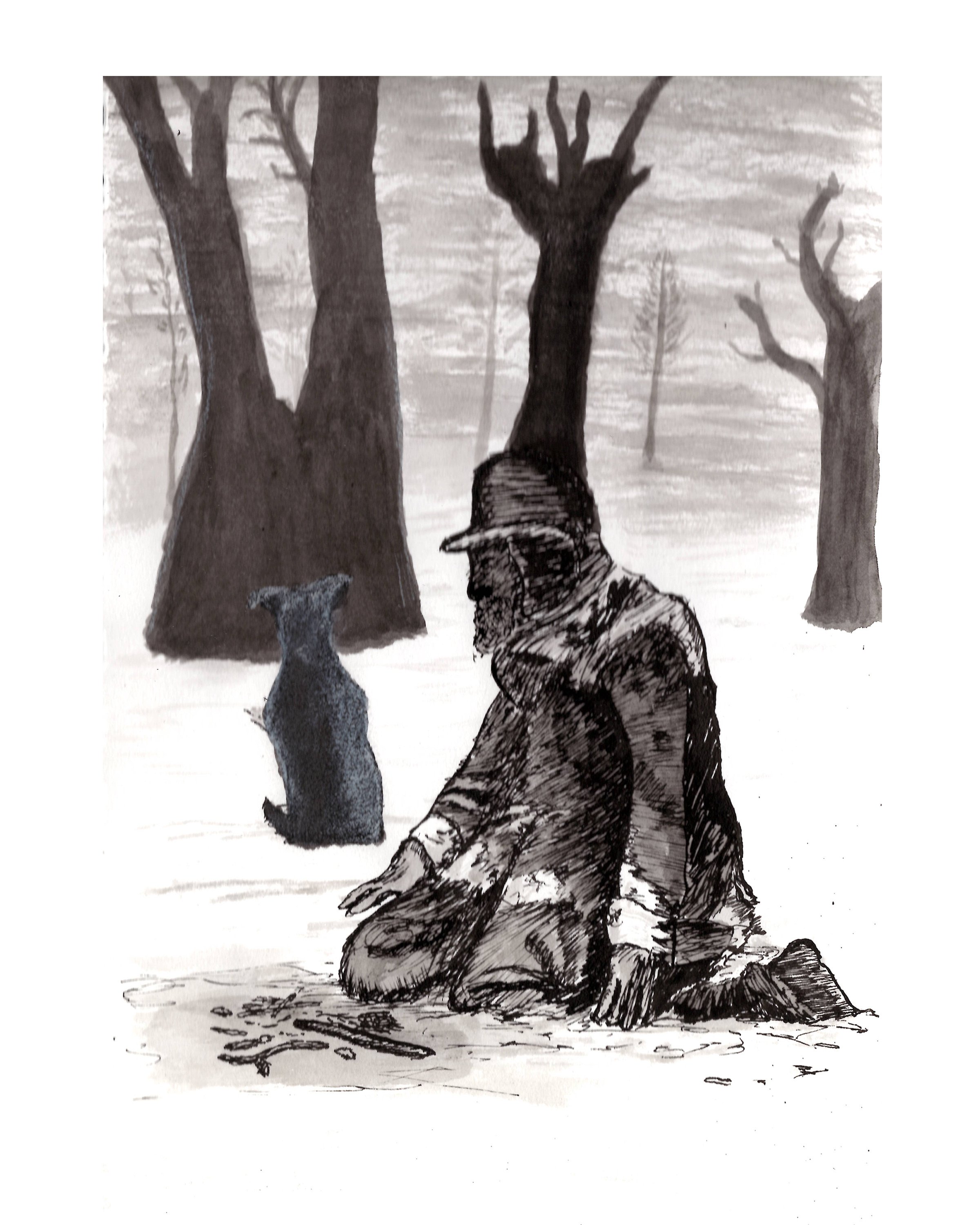
This piece was one of my “book Illustrations” done in ink and white charcoal. The man is modeled after a drawing by Frank Earl Schoonover specifically for Jack London’s To Build a Fire circa 1908. As I have a deep emotional connection to this story, I modeled the silhouette of the dog after my dog, Sox, who I grew up with, providing more of a connection for myself, as when I read the story I imagine my journey with my dog. I was an amateur with ink at the time but still managed to provide a sense of isolation and cold that the story conveys. In hindsight there could be more detail on the bases of the trees and dog in terms of shadows. I made use of my practice with the white charcoal of the figure drawings to show light on hitting the dog. I tried using positive and negative space techniques to give the trees an imposing and entirely static look. Like the rest of this piece, my detailing of the man was done with an old calligraphy pen I had found. This was one of my first pieces done using this method. It felt ritualistic; I was stitching an image of a story with pen and ink, the same materials the story was likely first drafted with.
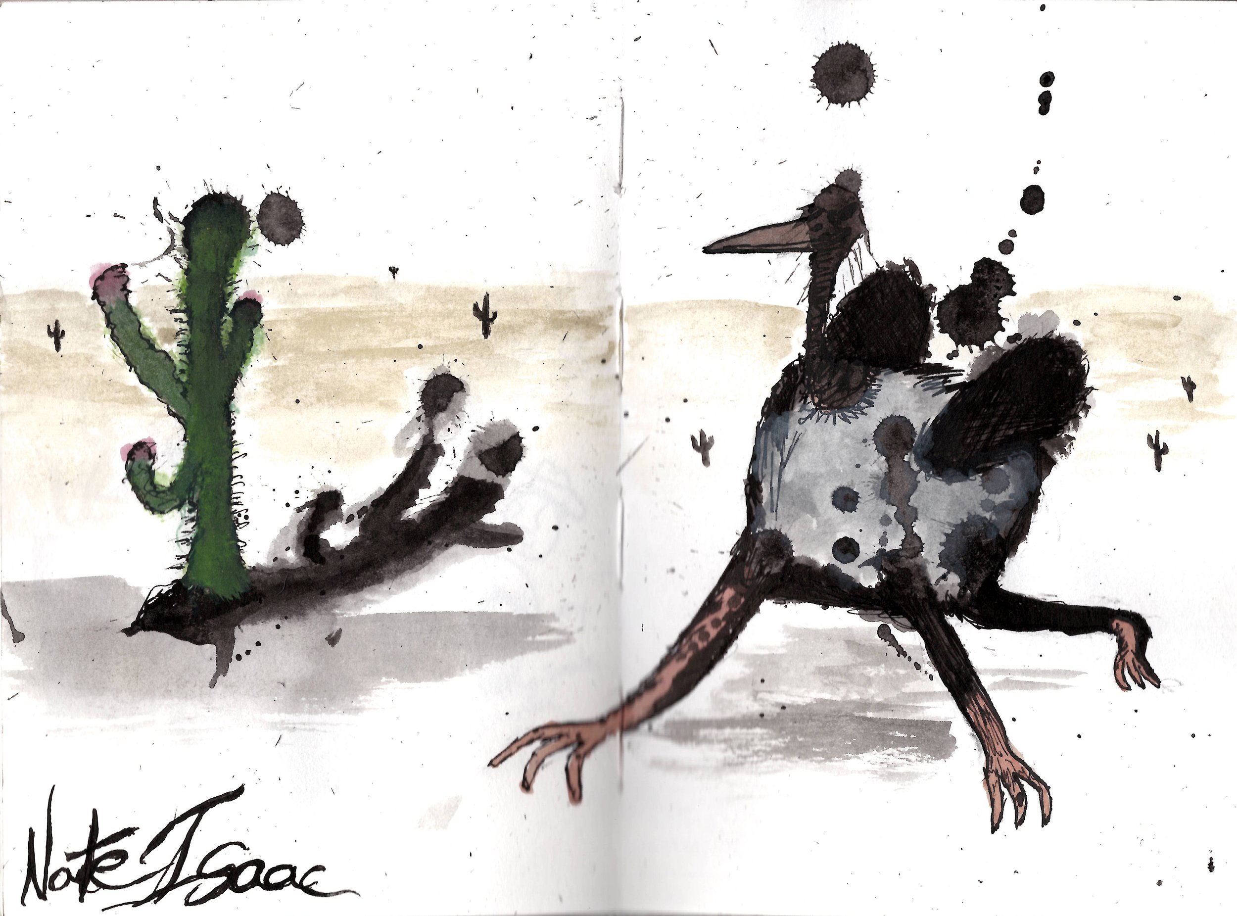
This piece was the result of an obsession with the works of Ralph Steadman and his illustrations of Hunter S. Thompson’s 1971 novel Fear and Loathing in Las Vegas. Done the same semester as my illustration of To Build a Fire, I wanted to try his method of creating a piece. This starts by pelting the workspace with ink and as it dries you look for the potential shapes and scenes. My aim was to embrace the absurd, nostalgic, chaos of the novel and its illustrations. I questioned, “What other beings might one see if they were to take a similar journey? And how crazy is too crazy?” With the ethos and environment of the novel in mind, I imagined an ostrich, something native to the desert, but not the Mojave. I gave it the wings of a fly and angular, cat-eye-esque sunglasses and a third leg. On the opposite side there is a cactus with a cobweb to balance out the overall image. An added detail is my name is signed in a similar font to steadman’s own handwriting. This semester’s worth of work was largely novel and author influenced (a theme I seem to be rather fond of), the result is a spread of rather well read material that I am proud of. I deeply absorbed the works of which I was illustrating and went to work with the materials of their time instead of modernizing the past.
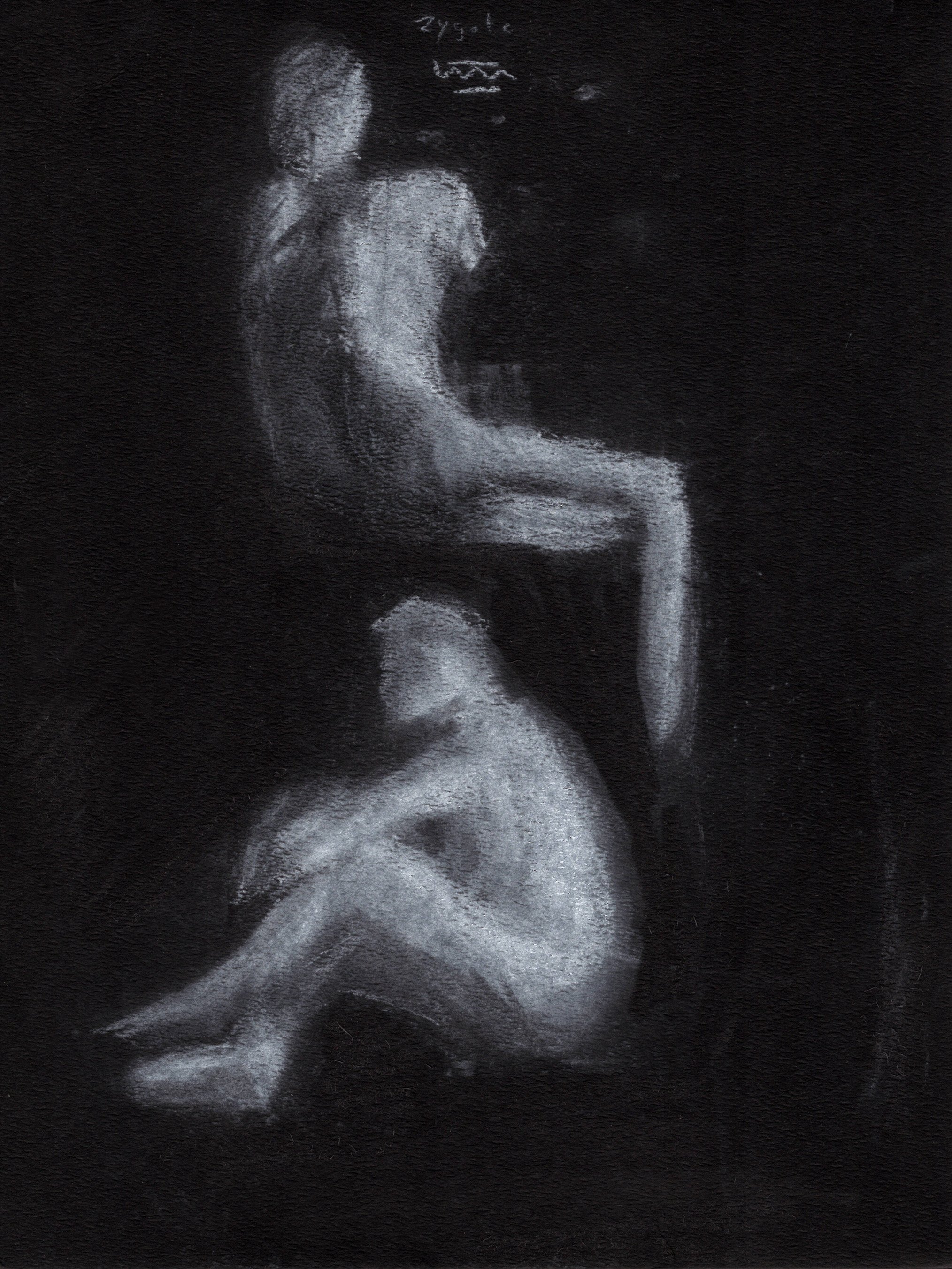
These were a set of Figure Drawings done with a live model in my Drawing 2 class. Instead of using charcoal on white paper to illustrate the shapes of shadows on the figure, we used white charcoal and black paper to capture the light hitting the subject. Although it seemed rather typical to just invert what we’d already done, such an exercise allowed me to see the process in a different way. At first it felt like I was only getting a little detail from the subject, but in actuality the light itself was my subject, and the model was its terrain. The result is something I’m immensely proud of. The media itself lends well to this practice as the amount of opacity on any given portion of the workspace is easy to control with applying varied pressure.
This piece was done for my first in-person class at CCAC, which was Colors or Color Theory. My professor’s instruction was to abstract something that I greatly enjoyed, so I chose Wu-Tang Clan’s first album, Enter the Wu-Tang. I wanted to illustrate the various themes and imagery of the album: Crack vials (members sold crack in the late 80s and early 90s) their trials are talked about in the lyrics The frog, scorpion, centipede, snake and lizard are references to the kung fu film Five Deadly Venoms. It is also a favorite film amongst the members. There is also the weapon from The Flying Guillotine in the upper left corner, a film referenced by the RZA. The head of Voltron, The Wu-Tang Clan often likens themselves to Voltron, skilled by themselves, but when together they elevate their craft. Green Land Cruiser, a car that was popular and a sign of wealth. Various accessories of the era, 40 oz. bottles, marijuana blunts and pipes, a basketball hoop, and stacks of money. The hat of Indiana Jones, referenced in Clan In Da Front The mark of the Five Percent Nation of Islam, a belief of which was referenced across the album as well as by other artists of the time. Bees, The WTC fans are referred to as “Killer Bees” Audio equipment, the is a sampler that they used to capture the audio of their favorite kung fu movies for their album. There is Raekwon’s “Killer Tape” which infamously goes missing during a skit on the album. The centerpiece is an apartment building that doubles as a giant speaker. I think my scope was right, however the composition and detail leaves a lot to be desired, even though I was going for a cartoon icon style. This was only the second piece I’ve ever done with gauche and I think that does show at parts. The perspective on the car is wrong as well.
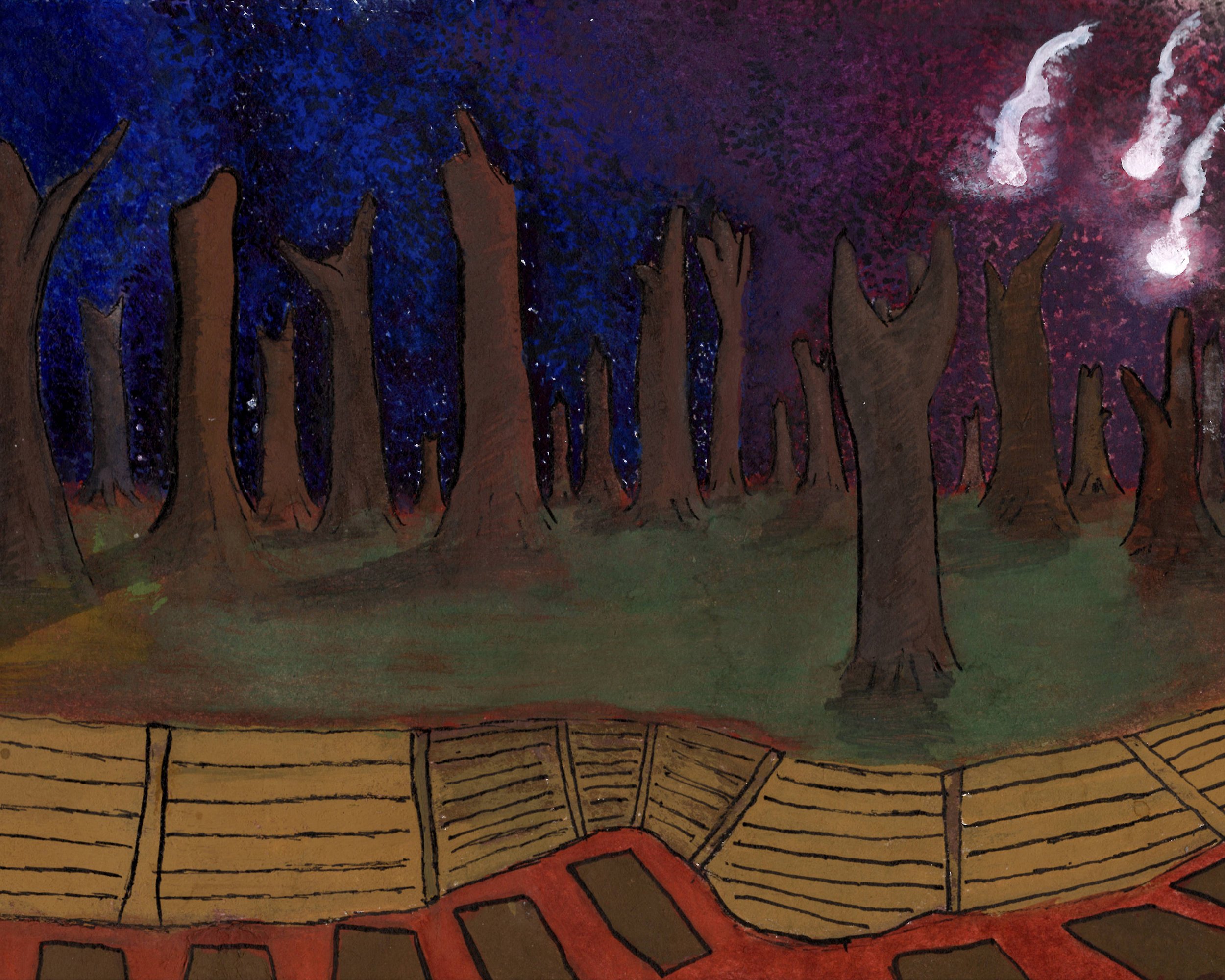
This was my attempt to make an impressionist-style depiction of the trenches of the First World War. This was one of two gauche pieces I’d made for my Colors, or Color Theory class. The type of gauche was one I’d never tried before, acrylic gouache. It dries much faster and is not water soluble like the gouache I was used to. This was a hard adjustment at first because I was working too slowly to manipulate the details that I wanted. I had waited for the sky to look how I wanted to start on detailing the trees, and by that time I had a decent understanding of how my materials worked. I’m still quite proud of my detailing on these trees, the way the lights and shadows play off of them in particular. There is no detail otherwise on any of the terrain or siding of the trenches. I now know the difference between detailing with a brush and detailing with a pen. The idea is to see shapes and not lines, a lesson I’ve taken a long time to learn. The impressionist influence came in the form of the dotting of color in the sky. My mistake was not varying the values in the sky and instead just dotting the sky with the color I wanted in a gradient. The line work that is there was done with a fine-lining pen, and it was purposely limited so that I could fill more in with gouache.
After my third semester at CCAC I had a new drive for learning art. I was originally going for social sciences but found I had more interest in creating things. I would just hang out at my desk and doodle away over Christmas break in my sketchbooks. I didn't have much of an idea for this piece and sort of going by instinct. I did know that I wanted to make a Lovecraftian space monster and something to juxtapose it. The monster is covered in empty sockets, save for one eye at its front. Its design is rough on purpose. For the design of the astronaut, I went for a Sunday paper comic strip look, it’s simple but freeing. The style allows for imperfections and strange details. I used felt tipped Faber Castell fine liners, I’ve since grown attached to this particular brand and set because they were the first fine liner I’d purchased. To fill in the background I used the bold tip and rather primitively shade it in. The end result was rather messy but the flecks of white that shine through act as interesting space shapes.
This was one of my first portraits. Done for the first college art class I took, Drawing 1 during my third semester at CCAC. It is of the writer Charles Bukowski and given how long ago I made it, I’m surprised I still like it as much as I do. This class was entirely online, a fair number of the students were not Art majors, and we met over Zoom only twice for critique. All that in mind, I didn’t think my professor had much expectation in any of us given our circumstances. I had also not taken an art class in a year, thinking my future studies were in another field; and although this time was fraught with stress and anguish, I remember the time spent in my room turned workshop, making pieces that resonated with me then and now, as they still embody aspects of that time. What I learned most from this piece was patience. I went through two different scaling drafts of this piece before the final sketch was accurate to my reference photo. Even then, I had to gently layer on detail, lines and shading, again until satisfied with it. Overall, I spent about three days total on this, in-between dishwashing shifts and virtual classes. Much like Bukowski himself; by day, doing what he had to in order to get by and following his passion for creating by night. Again this ritual nature of mimicking those I look up to becomes visible again.
